Some time ago, I have become a freelancer worker. For this reason, I decided to move away from wordpress.com and this kind of hobby blog and make a bit more professional website. It took some time, but it’s ready now!
I have move all the blog content to the new website. When it makes sense, I will try to update it to newer versions of QGIS and create new content regularly. Please follow me there. If you were following me using the RSS Feed, you can start using the following URL.
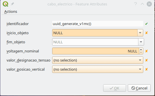
Make some fields read-only, like for example an identifier field.
Configure widgets better suited for each field, to help the user and avoid errors. For example, date-time files with a pop-up calendar, and value lists with dropdown selectors.
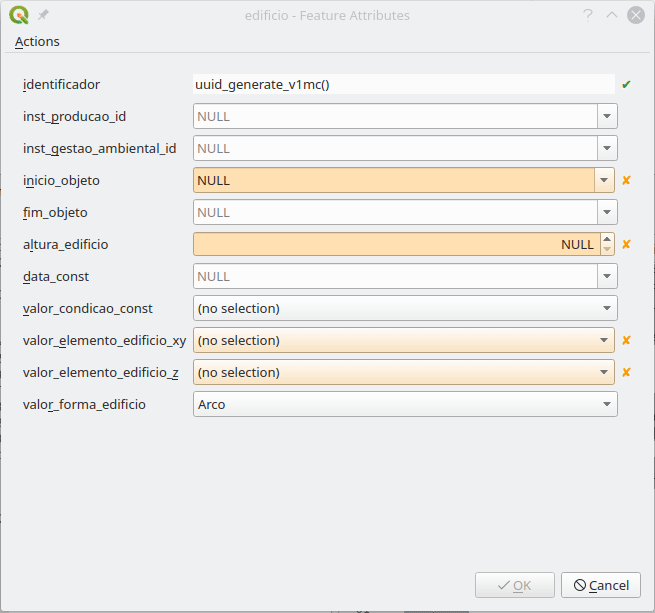
Basically, I wanted something like this:
Let me say that, in PostGIS layers, QGIS does a great job in figuring out the best widget to use for each field, as well as the constraints to apply. Which is a great help. Nevertheless, some need some extra configuration.
If I had only a few layers and fields, I would have done them all by hand, but after the 5th layer my personal mantra started to chime in:
“If you are using a computer to perform a repetitive manual task, you are doing it wrong!”
So, I began to think how could I configure the layers and fields more systematically. After some research and trial and error, I came up with the following PyQGIS functions.
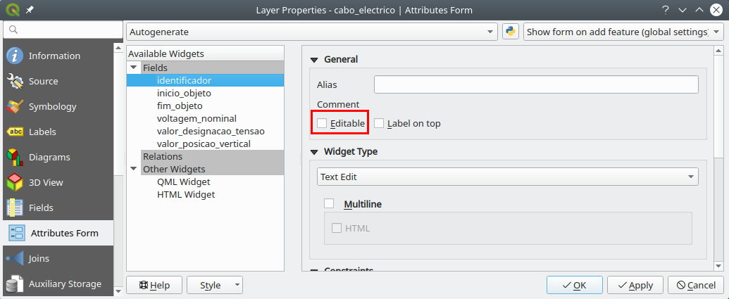
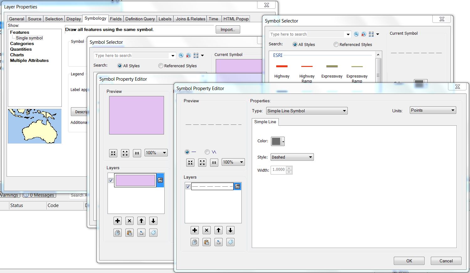
Make a field Read-only
The identifier field (“identificador”) is automatically generated by the database. Therefore, the user shouldn’t edit it. So I had better make it read only
To make all the identifier fields read-only, I used the following code.
def field_readonly(layer, fieldname, option = True):
    fields = layer.fields()
    field_idx = fields.indexOf(fieldname)
    if field_idx >= 0:
        form_config = layer.editFormConfig()
        form_config.setReadOnly(field_idx, option)
        layer.setEditFormConfig(form_config)

# Example for the field "identificador"

project = QgsProject.instance()
layers = project.mapLayers()

for layer in layers.values():
    field_readonly(layer,'identificador')
Set fields with DateTime widget
The date fields are configured automatically, but the default widget setting only outputs the date, and not date-time, as the rules required.
I started by setting a field in a layer exactly how I wanted, then I tried to figure out how those setting were saved in PyQGIS using the Python console:
Knowing this, I was able to create a function that allows configuring a field in a layer using the exact same settings, and apply it to all layers.
def field_to_datetime(layer, fieldname):
    config = {'allow_null': True,
              'calendar_popup': True,
              'display_format': 'yyyy-MM-dd HH:mm:ss',
              'field_format': 'yyyy-MM-dd HH:mm:ss',
              'field_iso_format': False}
    type = 'Datetime'
    fields = layer.fields()
    field_idx = fields.indexOf(fieldname)
    if field_idx >= 0:
        widget_setup = QgsEditorWidgetSetup(type,config)
        layer.setEditorWidgetSetup(field_idx, widget_setup)

# Example applied to "inicio_objeto" e "fim_objeto"

for layer in layers.values():
    field_to_datetime(layer,'inicio_objeto')
    field_to_datetime(layer,'fim_objeto')
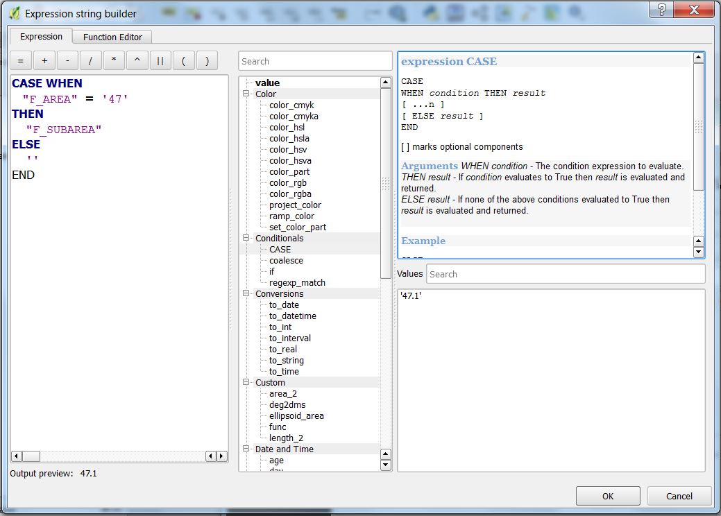
Setting a field with the Value Relation widget
In the data model, many tables have fields that only allow a limited number of values. Those values are referenced to other tables, the Foreign keys.
In these cases, it’s quite helpful to use a Value Relation widget. To configure fields with it in a programmatic way, it’s quite similar to the earlier example, where we first neet to set an example and see how it’s stored, but in this case, each field has a slightly different settings
Luckily, whoever designed the data model, did a favor to us all by giving the same name to the fields and the related tables, making it possible to automatically adapt the settings for each case.
The function stars by gathering all fields in which the name starts with ‘valor_’ (value). Then, iterating over those fields, adapts the configuration to use the reference layer that as the same name as the field.
def field_to_value_relation(layer):
    fields = layer.fields()
    pattern = re.compile(r'^valor_')
    fields_valor = [field for field in fields if pattern.match(field.name())]
    if len(fields_valor) > 0:
        config = {'AllowMulti': False,
                  'AllowNull': True,
                  'FilterExpression': '',
                  'Key': 'identificador',
                  'Layer': '',
                  'NofColumns': 1,
                  'OrderByValue': False,
                  'UseCompleter': False,
                   'Value': 'descricao'}
        for field in fields_valor:
            field_idx = fields.indexOf(field.name())
            if field_idx >= 0:
                print(field)
                try:
                    target_layer = QgsProject.instance().mapLayersByName(field.name())[0]
                    config['Layer'] = target_layer.id()
                    widget_setup = QgsEditorWidgetSetup('ValueRelation',config)
                    layer.setEditorWidgetSetup(field_idx, widget_setup)
                except:
                    pass
            else:
                return False
    else:
        return False
    return True

# Correr função em todas as camadas
for layer in layers.values():
    field_to_value_relation(layer)
Conclusion
In a relatively quick way, I was able to set all the project’s layers with the widgets I needed.
This seems to me like the tip of the iceberg. If one has the need, with some search and patience, other configurations can be changed using PyQGIS. Therefore, think twice before embarking in configuring a big project, layer by layer, field by fields.
QGIS recipes have been available on Conda for a while, but now, that they work for the three main operating systems, getting QGIS from Conda is s starting to become a reliable alternative to other QGIS distributions. Anyway, let’s rewind a bit…
What is Conda?
Conda is an open source package management system and environment management system that runs on Windows, macOS and Linux. Conda quickly installs, runs and updates packages and their dependencies. Conda easily creates, saves, loads and switches between environments on your local computer. It was created for Python programs, but it can package and distribute software for any language.
Why is that of any relevance?
Conda provides a similar way to build, package and install QGIS (or any other software) in Linux, Windows, and Mac.
As a user, it’s the installation part that I enjoy the most. I am a Linux user, and one of the significant limitations is not having an easy way to install more than one version of QGIS on my machine (for example the latest stable version and the Long Term Release). I was able to work around that limitation by compiling QGIS myself, but with Conda, I can install as many versions as I want in a very convenient way.
The following paragraphs explain how to install QGIS using Conda. The instructions and Conda commands should be quite similar for all the operating systems.
Anaconda or miniconda?
First thing you need to do is to install the Conda packaging system. Two distributions install Conda: Anaconda and Miniconda.
TL;DR Anaconda is big (3Gb?) and installs the packaging system and a lot of useful tools, python packages, libraries, etc… . Miniconda is much smaller and installs just the packaging system, which is the bare minimum that you need to work with Conda and will allow you to selectively install the tools and packages you need. I prefer the later.
Download anaconda or miniconda installers for your system and follow the instructions to install it.
Windows installer is an executable, you should run it as administrator. The OSX and Linux installers are bash scripts, which means that, once downloaded, you need to run something like this to install:
bash Miniconda3-latest-Linux-x86_64.sh
Installing QGIS
Notice that the Conda tools are used in a command line terminal. Besides, on Windows, you need to use the command prompt that is installed with miniconda.
Using environments
Conda works with environments, which are similar to Python virtual environments but not limited only to python. Basically, it allows isolating different installations or setups without interfering with the rest of the system. I recommend that you always use environments. If, like me, you want to have more that one version of QGIS installed, then the use of environments is mandatory.
Creating an environment is as easy as entering the following command on the terminal:
conda create --name <name_of_the_environment>
For example,
conda create --name qgis_stable
You can choose the version of python to use in your environment by adding the option python=<version>. Currently versions of QGIS run on python 3.6, 3.7, 3.8 and 3.9.
conda create –name qgis_stable python=3.7
To use an environment, you need to activate it.
conda activate qgis_stable
Your terminal prompt will show you the active environment.
(qgis_stable) aneto@oryx:~/miniconda3$
To deactivate the current environment, you run
conda deactivate
Installing packages
Installing packages using Conda is as simples as:
conda install <package_name>
Because conda packages can be stored in different channels, and because the default channels (from the anaconda service) do not contain QGIS, we need to specify the channel we want to get the package from. conda-forge is a community-driven repository of conda recipes and includes updated QGIS packages.
conda install qgis --channel conda-forge
Conda will download the latest available version of QGIS and all its dependencies installing it on the active environment.
Note: Because conda always try to install the latest version, if you want to use the QGIS LTR version, you must specify the QGIS version.
conda install qgis=3.10.12 --channel conda-forge
Uninstalling packages
Uninstalling QGIS is also easy. The quickest option is to delete the entire environment where QGIS was installed. Make sure you deactivate it first.
This only removes the QGIS package and will leave all other packages that were installed with it. Note that you need to specify the conda-forge channel. Otherwise, Conda will try to update some packages from the default channels during the removal process, and things may get messy.
Running QGIS
To run QGIS, in the terminal, activate the environment (if not activated already) and run the qgis command
conda activate qgis_stable
qgis
Updating QGIS
To update QGIS to the most recent version, you need to run the following command with the respective environment active
conda update qgis -c conda-forge
To update a patch release for the QGIS LTR version you run the install command again with the new version:
conda install qgis=3.10.13 -c conda-forge
Some notes and caveats
Please be aware that QGIS packages on Conda do not provide the same level of user experience as the official Linux, Windows, and Mac installer from the QGIS.org distribution. For example, there are no desktop icons or file association, it does not include GRASS and SAGA, etc …
On the other hand, QGIS installations on Conda it will share user configurations, installed plugins, with any other QGIS installations on your system.
A year ago I have asked QGIS’s community what were their favourite QGIS new features from 2015 and published this blog post. This year I decided to ask it again. In 2016, we add the release of the second long-term release (2.14 LTR), and two other stable versions (2.16 and 2.18).
2016 was again very productive year for the QGIS community, with lots of improvements and new features landing on QGIS source code, not to speak of all the work already in place for QGIS 3. This is a great assurance of the project’s vitality.
As a balance, I have asked users to choose wich were their favorite new features during 2016 (from the visual changelogs list). As a result, I got the following Top 5 features list.
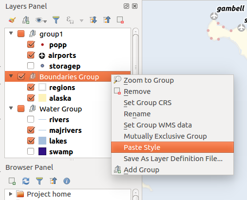
5 – Paste a style to multiple selected layers or to all layers in a legend group (2.14)
This is a productivity functionaly that I just realized that existed now, with so many people voting on it. If copy/paste styles was, in my opinion, a killer feature, being able to use it in multiple layers or even a group is just great.
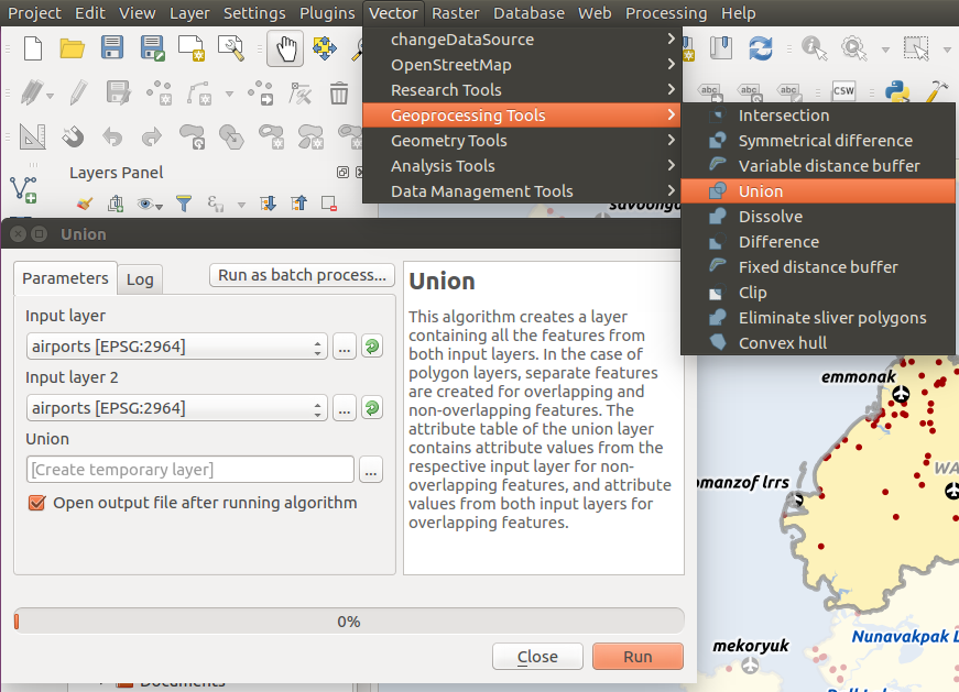
4 – fTools plugin has been replaced with Processing algorithms (2.16)
While checking the Vector Menu, the tools seem the same as previous version, but it’s when you open them that you understand the difference. All vector tools, provided until now by the fTools core plugin, were replaced by equivalent processing Algoritms. For the users it means easier access to more functionality, like running the tools in batch mode, or getting outputs as temporary layers. Besides some of the tools have been improved.
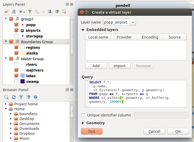
3 – Virtual layers (2.14)
This is definitly one of my favourite new features, and it seems I’m not alone. With virtual layers you can run SQL queries using the layers loaded in the project, even when the layers are not stored in a relational database. We are not talking about WHERE statments to filter data, with this you can do real SQL queries, with spatial analysis, aggregations, and so on. Besides, virtual layers will act as VIEWs and any changes to any of the input layers will automatically update the layer.
2 – Speed and memory improvements (2.14)
It’s no surprise that speed and memory improvements we one of the most voted features. Lots of improvements were made for loading and managing large datasets, and this have a tremendous impact in all users. According to the changelog, zoom is faster, selecting features is faster, updating attributes on selected features is faster, and it consumes less memory. So don’t be afraid to put QGIS to the test.
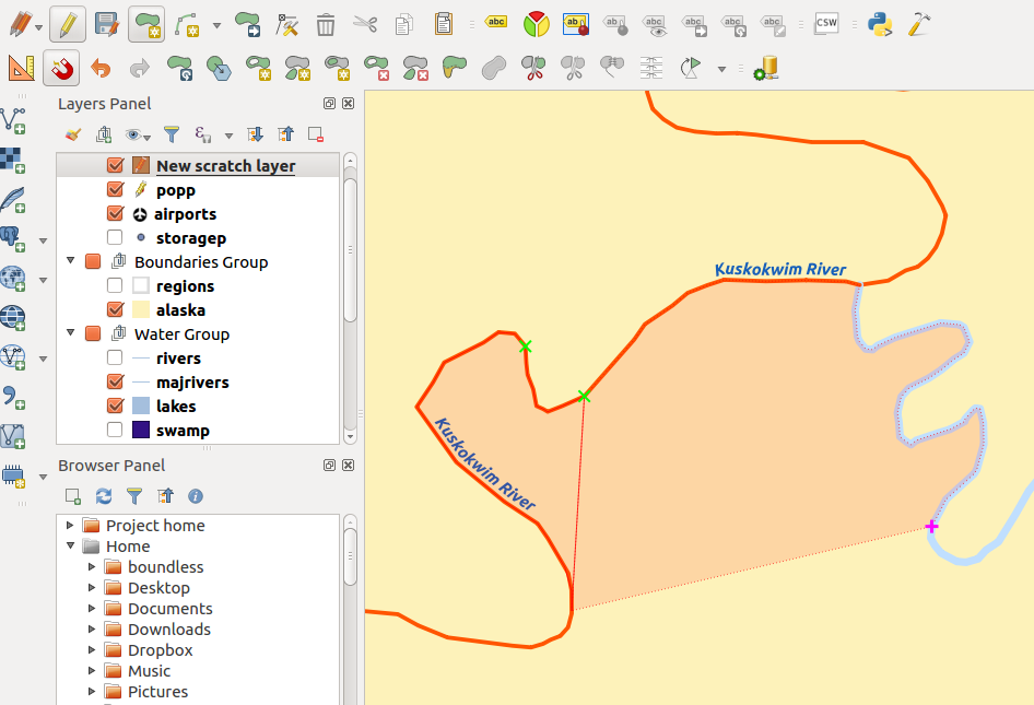
1 – Trace digitising tool (2.14)
If you do lots of digitising, you better look into this new feaure that landed on QGIS 2.14. It allows you to digitize new feature by using other layers boundaries. Besides the quality improvement of layers topology, this can make digitizing almost feel pleasing and fast! Just click the first point, move your mouse around other features edged to pick up more vertex.
There were other new features that also made the delight of many users. For example, several improvements on the labeling, Georeference outputs (eg PDF) from composer (2.16), Filter legend by expression (2.14), 2.5D Renderer. Personally, the Style docker made my day/year. But you can check the full results of the survey, if you like.
Obviously, this list means nothing at all. All new features were of tremendous value, and will be useful for thousands (yes thousands) of people. It was a mere exercise as, with such a diverse QGIS crowd, it would be impossible to build a list that would fit us all. Besides, there were many great enhancements, introduced during 2016, that might have fallen under the radar for most users. Check the visual changelogs for a full list of new features.
On my behalf, to all developers, sponsors, and general QGIS contributors, once again
From time to time, I read articles comparing ArcGIS vs QGIS. Since many of those articles are created from an ArcGIS user point of view, they invariably lead to biased observations on QGIS lack of features. It’s time for a QGIS user perspective, so bare with me on this (a bit) long, totally and openly biased post.
“Hello, my name is Alexandre, and I have been using… QGIS“
This is something I would say at an anonymous QGIS user therapy group. I’m willing to attend one of those because being recently and temporally forced to use ArcGIS Desktop again (don’t ask!), I really really really miss QGIS in many ways.
There was a time when I have used ArcGIS on the regular basis. I used it until version 9.3.1 and then decided to move away (toward the light) into QGIS (1.7.4 I think). At that time, I missed some (or even many?) ArcGIS features, but I was willing to accept it in exchange for the freedom of the Open Source philosophy. Since then, a lot have happened in the QGIS world, and I have been watching it closely. I would expect the same have happened in ArcGIS side, but, as far I can see, it didn’t.
I’m using top shelf ArcGIS Desktop Advanced and I’m struggling to do very basic tasks that simply are nonexistent in ArcGIS. So here’s my short list of QGIS functionalities that I’m longing for. For those of you that use ArcGIS exclusively, some of this features may catch you by surprise.
Warning: For those of you that use ArcGIS exclusively, some of this features may catch you by surprise.
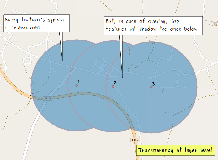
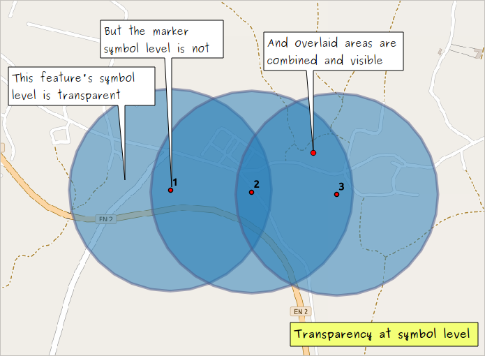
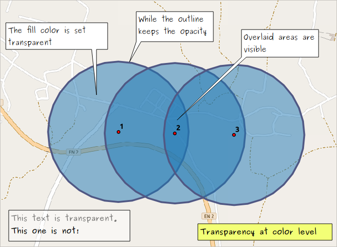
Transparency control
“ArcGIS have transparency! It’s in the Display tab, in the layer’s properties dialog!”
Yes, but… you can only set transparency at the layer level. That is, either it’s all transparent, or it’s not…
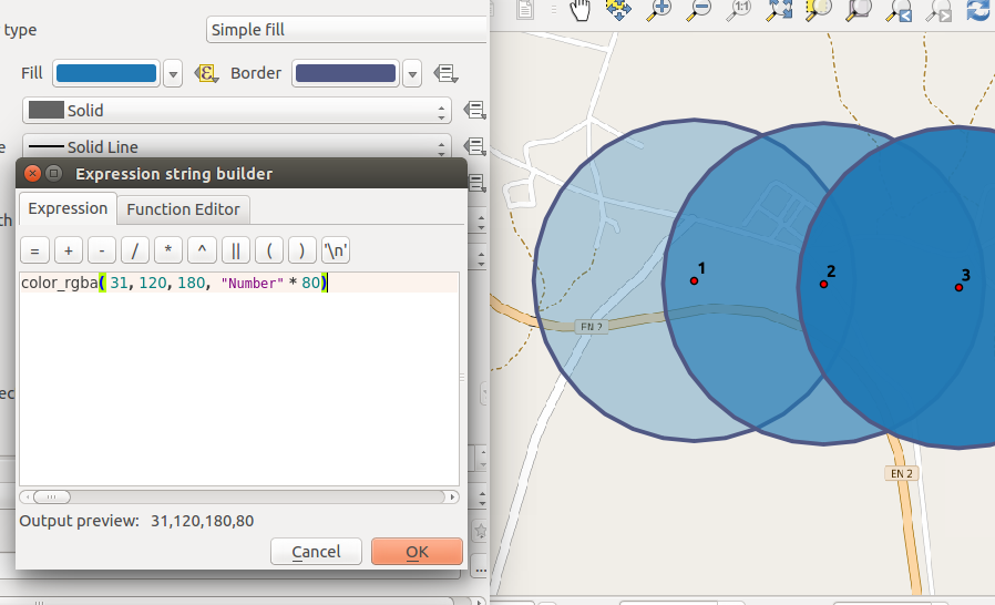
In QGIS on the other end, you can set transparency at layer level, feature/symbol level, and color level. You can say that this is being overrated, but check the differences in the following images.
Notice that in QGIS you can set transparency at color level everywhere (or almost everywhere) there is a color to select. This includes annotations (like the ones in the image above), labels and composers items. You can even set transparency in colors by using the RGBA function in an expression! How sweet can that be? 🙂
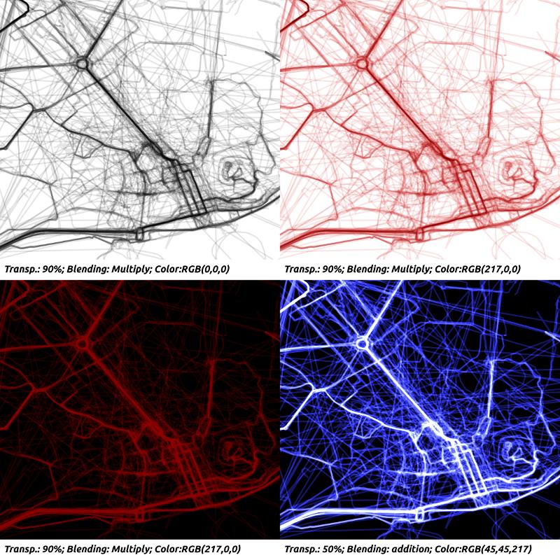
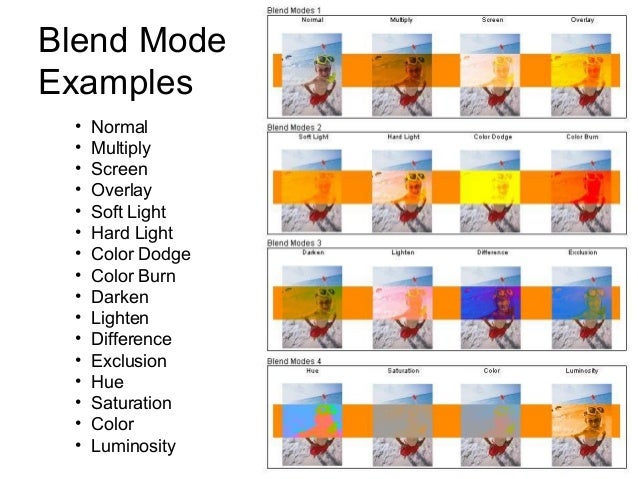
Blending modes
This is one of QGIS’s pristine jewels. The ability to combine layers the way you would do in almost any design/photo editing software. At layer or at feature level, you can control how they will “interact” with other layers or features below. Besides the normal mode, QGIS offers 12 other blending modes: Lighten, Screen, Dodge, Darken, Multiply, Burn, Overlay, Soft light, Hard light, Difference, and Subtract. Check this page to know more about the math behind each one and this image for some examples
It’s not easy to grasp how can this be of any use for cartography before you try it yourself. I had the chance to play around while trying to answer this question.
A very common application for this functionality is when you want to add shadows to simulate the relief by putting a hill shade on top of other layers. In ArcGIS, you can only control the layer transparency, and the result is always a bit pale. But in QGIS, you can keep the strength of the original colors by using the multiply mode in the hill shade layer.
Hypsometry original colors
Hypsometry colors paled by transparent hill shade
Hypsometry original colors with the hill shade using QGIS multiply blending
You can also use blending modes in the print composer items, allowing you to combine them with other items and textures. This gives you the opportunity to make more “artistic” things without the need to go post-processing in a design software.
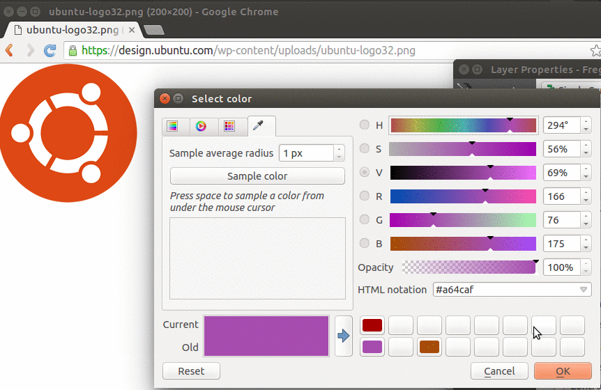
Colour Picker Menu
Controlling color is a very important deal for a cartographer and QGIS allow you to control it like the professional you are. You can select your colours using many different interfaces. Interfaces that you might recognize from software like Inkscape, Photoshop, Gimp and others alike.
My favorite one is the color picker. Using color picker, you can pick colors from anywhere on your screen, either from QGIS itself or outside. This is quite handy and productive when you are trying to use a color from your map, it’s legend, a COLOURlovers palette or a company logo.
Picking a color from outside QGIS
You can also copy/paste colors between dialogs, save and import color palettes, and you can even name a color and use it in a variable. With all this available for free, it’s hard to swallow Windows color selector :(.
Vector symbols renderers “powertools”
In ArcGIS, you have a few fancy ways to symbol your vector layers. You got: Single symbol, Unique values, Unique values many fields… and so on. At the first glance, you may think that QGIS lacks some of them. Believe me, it doesn’t! In fact, QGIS offers much more flexibility when you need to symbol your layers.
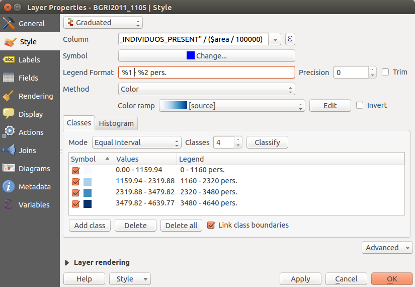
For starters, it allows you to use fields or expressions on any of the symbols renderers, while ArcGIS only allows the use of fields. Powered by hundreds of functions and the ability to create your owns in python, what you can do with the expression builder has no limits. This means, for instance, that you can combine, select, recalculate, normalize an infinite number of fields to create your own “values” (not to mention that you can tweak your values labels, making it ideal to create the legend).
QGIS Graduated renderer using an expression to calculate population density
And then, in QGIS, you have the special (and kinda very specific) renderers, that make you say “wooooh”. Like the Inverted polygons that allow you to fill the the outside of polygons (nice to mask other features), the Point displacement to show points that are too close to each others, and the Heatmap that will transform, ON-THE-FLY, all your points in a layer into a nice heatmap without the need to convert them to raster (and that will update as soon as you, or anyone else, edits the point features).
Inverted Polygon Renderer masking the outside of an interest area
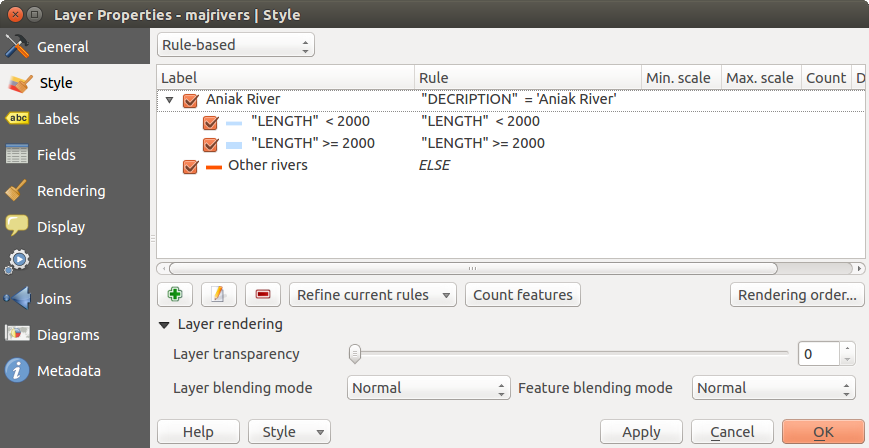
But I have left the best to the end. The “One rendered to Rule them all”, the Rule-based symbols. With the rule-based renderer, you can add several rules, group them in a tree structure, and set each one with a desired symbol. This gives QGIS users full control of their layer’s symbols, and, paired with expression builder and data-defined properties, opens the door to many wonderful applications.
Rule-based renderer
Atlas
One of my favorite (and missed) features in QGIS is the Map Composer’s Atlas. I know that ArcGIS has its own “Atlas”, the Data Driven Pages, but frankly, it’s simply not the same.
I believe you know the basic functionally that both software allow. You create a map layout and choose a vector layer as coverage, and it will create an output panned or zoomed for each of the layer’s feature. You can also add some labels that will change according to the layers attributes.
But in QGIS, things go a little bit further…
Basically, you can use coverage layer’s attributes and geometry anywhere you can use an expression. And, in QGIS, expressions are everywhere. That way, most layers and map composer items properties can be controlled by a single coverage layer.
Auto-resized maps that fits the coverage features at specific scale using atlas
So, if you pair Atlas it with QGIS data-defined properties, rule-based symbols and expressions, ArcGIS Data Driven Pages are no match. You don’t think so? Try to answer this question then.
Tip: If you really want to leverage your map production, using Spatialite or Postgis databases you can create the perfect atlas coverage layers from views that fit your needs. No data redundancy and they are always updated.
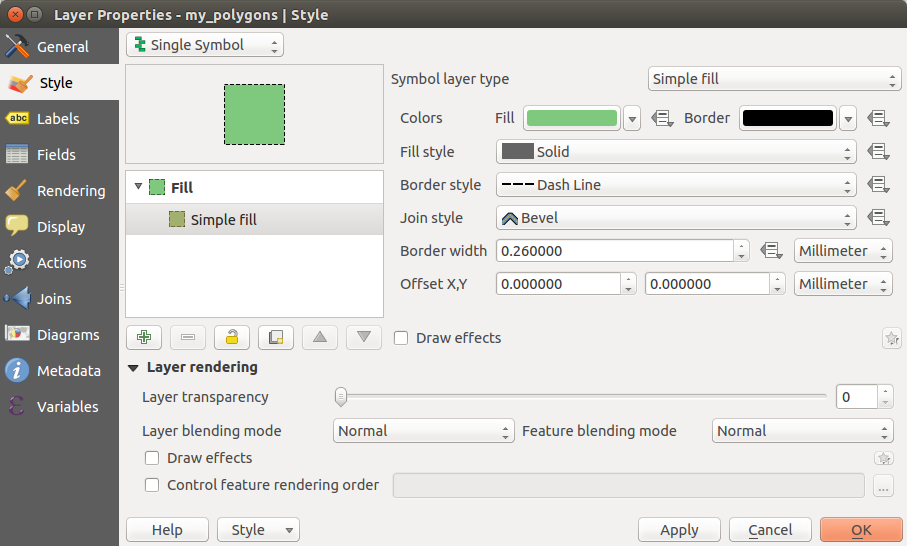
Label and Style dialogs
This one is more of a User Experience thing than an actual feature, but you won’t imagine how refreshing it is to have all Style and Labels options in two single dialogs (with several tabs, of course).
Using the symbol menu in ArcGIS makes me feel like if I’m in the Inception movie, at some point in time, I no longer know where the hell am I. For example, to apply a dashed outline in a fill symbol I needed to open 5 different dialogs, and then go back clicking OK, OK, OK, OK …
ArcGIS “Inception” symbol settings
In QGIS, once in the properties menu, every setting is (almost) one click way. And you just need to press OK (or Apply ) once to see the result!
QGIS Style setting
As an extra, you can copy/paste styles from one layer to another, making styling several layers even faster. And now you say:
“Don’t be silly! In ArcGIS you can import symbols from other layers too.”
Symbols? yes. Labels? No! And if you had lots of work setting your fancy labels, having to do the exact same/similar thing in another layer, it will make you wanna cry… I did.
(I think I will leave the multiple styles per layer vs data frames comparison for another time)
In a GIS world that, more and more, is evolving towards Open Data, Open Standards and OGC Web Services, this reveals a very mercantile approach by ESRI. If I were an ESRI customer, I would feel outraged. <sarcasm>Or maybe not… maybe I would thank the opportunity to yet invest some more money in it’s really advanced features…<\sarcasm>
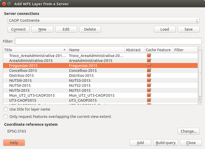
In QGIS, like everything else, WFS is absolutely free (as in freedom, not free beer). All you need to do is add the WFS server’s URL, and you can add all the layers you want, with the absolute sure that they are as updated as you can get.
Fortunately for ArcGIS users with a low budget, they can easily make a request for a layer using the internet browser :-P.
Or they can simply use QGIS to download it. But, in both cases, be aware that the layers won’t update themselves by magic.
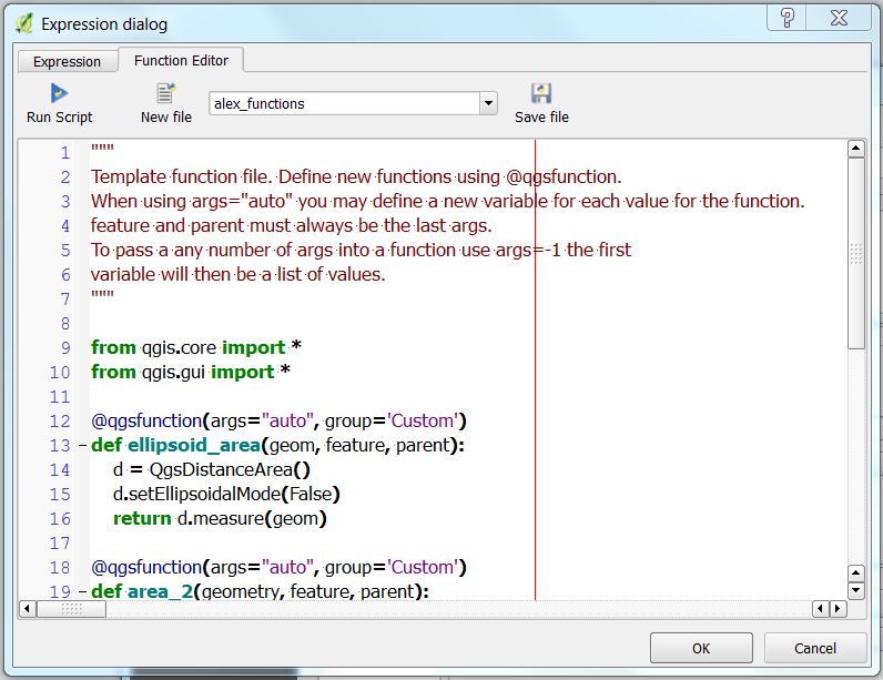
Expression builder
I have already mentioned the use of expressions several times, but for those of you that do not know the expression Builder, I though I end my post with one of my all time favourite features in QGIS.
I do not know enough of ArcGIS expression builder to really criticize it. But, AFAIK, you can use it to create labels and to populate a field using the field calculator. I know that there are many functions that you can use (I have used just a few) but they are not visible to the common user (you probably need to consult the ArcGIS Desktop Help to know them all). And you can create your own functions in VBScript, Python, and JsScript.
On QGIS side, like I said before, the Expression Builder can be used almost everywhere, and this makes it very convenient for many different purposes. In terms of functions, you have hundreds of functions right there in the builder’s dialog, with the corresponding syntax help, and some examples. You also have the fields and values like in ArcGIS, and you even have a “recent expressions” group for re-using recent expressions with no the need to remember prior expression.
Besides, you can create your own functions using Python (no VBScript or JsScript). For this purpose, you have a separate tab with a function editor. The editor have code highlighting and save your functions in your user area, making it available for later use (even for other QGIS sessions).
Conclusion
These are certainly not the only QGIS features that I miss, and they are probably not the most limiting ones (for instance, not being able to fully work with Spatialite and Postgis databases will make, for sure, my life miserable in the near future), but they were the ones I noticed right away when I (re)open ArcGIS for the first time.
I also feel that, based on the QGIS current development momentum, with each QGIS Changelog, the list will grow very fast. And although I haven’t tested ArcGIS Pro, I don’t think ESRI will be able to keep the pace.
“Are there things I still miss from ArcGIS?” Sure. I miss CMYK color support while exporting maps, for instance. But not as much as I miss QGIS now. Besides, I know that those will be addressed sooner or later.
In the end, I kinda enjoyed the opportunity to go back to ArcGIS, as it reinforced the way I think about QGIS. It’s all about freedom! Not only the freedom to use the software (that I was already aware) but also the freedom to control software itself and it’s outputs. Maintaining the users friendliness for new users, a lot have been done to make power users life easier, and they feel very pleased with it (at least I am).
With the release of the first long term release (2.8 LTR), and two other stable versions (2.10 and 2.12), 2015 was a great (and busy) year for the QGIS community, with lots of improvements and new features landing on QGIS source code.
As a balance, I have asked users to choose wich were their favorite new features during 2015 (from the visual changelogs list). As a result I got the following Top 5 features list.
Today I needed to create a view in PostGIS that returned the vertexes of a multi-polygon layer. Besides, I needed that they were numerically ordered starting in 1, and with the respective XY coordinates.
It seemed to be a trivial task – all I would need was to use the ST_DumpPoints() function to get all vertexes – if it wasn’t for the fact that PostGIS polygons have a duplicate vertex (the last vertex must be equal to the first one) that I have no interess in showing.
After some try-and-fail, I came up with the following query:
CREATE OR REPLACE VIEW public.my_polygons_vertexes AS
WITH t AS -- Transfor polygons in sets of points
    (SELECT id_polygon,
            st_dumppoints(geom) AS dump
     FROM public.my_polygons),
f AS -- Get the geometry and the indexes from the sets of points
    (SELECT t.id_polygon,
           (t.dump).path[1] AS part,
           (t.dump).path[3] AS vertex,
           (t.dump).geom AS geom
     FROM t)
-- Get all points filtering the last point for each geometry part
SELECT row_number() OVER () AS gid, -- Creating a unique id
       f.id_polygon,
       f.part,
       f.vertex,
       ST_X(f.geom) as x, -- Get point's X coordinate
       ST_Y(f.geom) as y, -- Get point's Y coordinate
       f.geom::geometry('POINT',4326) as geom -- make sure of the resulting geometry type
FROM f
WHERE (f.id_polygon, f.part, f.vertex) NOT IN
      (SELECT f.id_polygon,
              f.part,
              max(f.vertex) AS max
       FROM f
       GROUP BY f.id_polygon,
                f.part);
The interesting part occurs in the WHERE clause, basically, from the list of all vertexes, only the ones not included in the list of vertexes with the maximum index by polygon part are showed, that is, the last vertex of each polygon part.
Here’s the result:
The advantage of this approach (using PostGIS) instead of using “Polygons to Lines” and “Lines to points” processing tools is that we just need to change the polygons layer, and save it, to see our vertexes get updated automatically. It’s because of this kind of stuff that I love PostGIS.
Now and then I get too many map symbols (points) in the same place, and I thought how nice it would be if we could drag n’ drop them around without messing with their geometries position, just like we do with labels. That thought gave me an idea for a cool hack.
Choose your point layer and start by creating two new fields called symbX and symbY (Type: Decimal number; Size: 20; Precision: 5). Now go the layer properties and in the Style tab edit your symbol. For each level of your symbol select “map units” as the offset units, and set the following expression in the offset data define properties option:
CASE WHEN symbX IS NOT NULL AND symbY IS NOT NULL THEN
    tostring($x - symbX) + ',' + tostring($y - symbY)
ELSE
    '0,0'
END
Be aware that, if your coordinates have negative values, you need to adapt the code. E.g., If you have negative values in X you should use “tostring(symbX -$x)” instead.
Now, temporarly label your layer with a small convenient text (I used a centered ‘+’ (plus sign) with a white buffer) and set its coordinates to data defined using the symbX and symbY Fields.
From this point on, when you use the move label tool, not only the label position change but also the actual symbol! Pretty cool, isn’t it?
Notice that the features geometries are not changed during the process. Also, remember that in this case you can also add leading lines to connect the symbols to the original position of the points.
The expression seems quite simple, but it toke me some time before I realize that, not having a x(geometry) and y(geometry) functions, I could use the xmin() and ymin() to get the coordinates of the polygons centroids. Since this wasn’t the first time I had to use this expressions, this post will work as a reminder for the future.
Recently I had the need to add labels to features with very close geometries, resulting in their collision.
Using data-defined override for label’s position (I have used layer to labeled layer plugin to set this really fast) and the QGIS tool to move labels, it was quite easy to relocate them to better places. However, in same cases, it was difficult to understand to which geometry they belonged.
I needed some kind of leading lines to connect, whenever necessary, label and feature. I knew another great plugin called “Easy Custom Labeling“, by Regis Haubourg, that did what I needed, but it would create a memory duplicate of the original layer, wish meant that any edition on the original layer wouldn’t be updated in the labels.
Since the data were stored in a PostgreSQL/Postgis database, I have decided to create a query that would return a layer with leading lines. I used the following query in DB manager:
SELECT
  gid,
  label,
  ST_Makeline(St_setSRID(ST_PointOnSurface(geom),27493), St_setSRID(St_Point(x_label::numeric, y_label::numeric),27493))
FROM
  epvu.sgev
WHERE
  x_label IS NOT NULL AND
  y_label IS NOT NULL AND
  NOT ST_Within(ST_Makeline(St_setSRID(ST_PointOnSurface(geom),27493), St_setSRID(St_Point(x_label::numeric, y_label::numeric),27493)),geom))
This query creates a line by using the feature centroid as starting point and the label coordinate as end point. The last condition on the WHERE statement assures that the lines are only created for labels outside the feature.
With the resulting layer loaded in my project, all I need is to move my labels and save the edition (and press refresh) to show a nice leading line.


